

Most of us have a favorite color, but few of us bother to ponder more than superficially the deep art and science of color. How can it impact our impression of products, brands and even our mood? There are others who are devoted to delving into these topics –– from researching how to ensure consistent application of colors, to different materials and substrates, to forecasting tomorrow’s “hot” shades and hues.
Judith van Vliet, a color expert
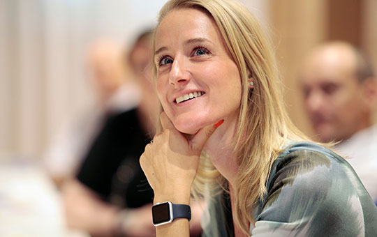
One of those is Judith van Vliet, a designer at Clariant’s ColorWorks® design and technology center in Merate, Italy. In January 2012, Judith began working at Clariant, a Switzerland-based speciality chemicals company. She has led the firm’s ColorForward® color-forecasting team, which produces an annual color forecasting guide for designers who use plastics in their products and packaging.
Prior to joining Clariant, van Vliet, now 37, did freelance market and trend research in Italy. She also worked as a product planning specialist for Kawasaki Motors Europe where she provided European color and trend reports to the firm’s designers based in Japan. While at Kawasaki, a colleague strongly urged her to attend a Color Marketing Group event that was coming up in Berlin, Germany.
She went, somewhat apprehensively, wondering how she’d fit in, but said, “Immediately there was a ‘click.’ … These people speak my language. We feel the same way, we talk about how color is in our emotional language, so I was immediately in love. And at that moment I decided that this was what I wanted to do in life.”
van Vliet became active in the Alexandria, Virginia-based CMG (www.colormarketing.org). In 2015, she began a three-year stint as the group’s vice president for communications and public relations. Then, in January 2018, the Netherlands native was elected to a two-year term as CMG’s president. As such, she became the first European, and the first millennial, to hold that post for the 58-year-old, not-for-profit, international association of color design professionals.
Venturing into the ChromaZone

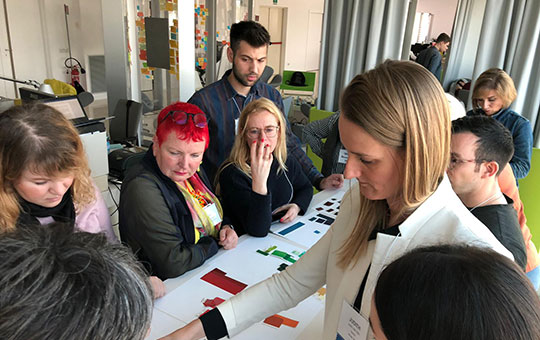
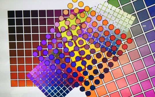
CMG is known for its research into assessing future color directions. It holds so-called ChromaZone® color forecasting workshops around the world each year, in venues ranging from Shanghai and Milan to Montreal and Lima, Peru. At these events, like-minded professionals from different sectors bring their own color trends research and make brief presentations. They break into groups and brainstorm about all the proposed colors and underlying themes. Then, they reach a consensus on the 16 color selections they intend to put forward for consideration at various regional CMG events.
This global process eventually leads to a consensus forecast of 64 colors, to be revealed as the 2021+ World Color Forecast™ at CMG’s annual International Summit. This year’s summit will be held in Tucson, Arizona, from Nov. 15-17. These color selections often prove to be hugely influential across many spectrums, ranging from consumer goods and automobiles, to fashion and interior design.
van Vliet also was a founding committee member of CMG’s monthly Color Alerts® (www.colormarketing.org/color-alerts). Its purpose is to evaluate and validate previously forecast colors by documenting real-world applications of those projected hues.

In a telephone interview shortly after she hosted a ChromaZone color forecasting workshop during Milan Design Week, van Vliet reflected on her career path and on what she’s learned about color along the way.
She began at Kawasaki by focusing narrowly on the automotive market, but CMG now has provided exposure to a broad swath of other industries. She noticed that, especially when it comes to color, material and finish (CMF), there is quite a bit of synergy among seemingly unrelated sectors, such as between consumer electronics and automotive sectors.
Need help with your research?
Prospector can help speed along your research with technical datasheets and access to global equipment suppliers.
Create your free account today!
Color trends cross industry lines

“That’s when I learned that color was a big world and there is what we call ‘contamination’ of trends, finishes and colors from different markets. I think that is something that is new. A couple of years ago, most designers and most brands were not too much aware…they would look at their own market, their segment, but they were not looking at those that maybe were inherent to their market.
When looking into automotive, for example—especially for interior finishes—it’s important to also look to other sectors such as sports or even fashion for inspiration. “If you’re a luxury brand such as Bentley or Aston Martin, certain trends, materials and finishes coming from interior design markets and from fashion, can apply to cars as well, because the car is an extension of the consumer’s personality. This is something that I learned, and that many brands are learning ––either through Color Marketing Group or through the online information that today is available.”
This is the third year that CMG has also been involved in color education. The group realizes that more and more people are hungry for information about the science behind color and how to use it properly.
Tips for avoiding product-launch delays
For those interested in successfully applying color, van Vliet offers the following advice: “Think about color in the early stages of design. Color is not an afterthought. But for some reason, we still have companies and brand owners who think about design, think about marketing, and when they are almost ready to launch, they come to a company like Clariant and say, ‘We need to match the color.’ That’s a moment when a lot of problems can occur.”
Sometimes a certain color on a given shape simply doesn’t look right, or certain pigments do not meet regulatory requirements for the application in question. This can especially be an issue for sensitive end uses such as food-contact, medical and toys, she notes.

“Very often, at the end of the design process, people come to match the colors, and then there are huge delays.” Product designers often fall in love with a color, based on a color chip or some other random inspiration, but then discover it’s not possible to exactly replicate the same hue in a plastics masterbatch as they have seen on an optical-white, paper-based color chip.
The same limitations can be true, she says, with metal effects. “Plastics will never look like metal. They’ll never feel like metal, and they’ll never have the demurring effect that that beautiful Tiffany Rose Pink will have, yet they’ll want it.”
So, van Vliet urges those developing products to go early in the process to those who will be involved in creating their colors to engage with their supplier sooner, to avoid disappointment and to avoid delays in bringing a product to market that can sometimes turn into weeks, if not months.
She also cautions against designers picking, for example, a color based on seeing it on a transparent polycarbonate or PET substrate if the primary resin they intend to use is HDPE. HDPE is not transparent and they will never get the beauty of the transparent color. “It sometimes will take an hour to explain it, till they get it.” Sometimes, actual physical samples have to be molded before the reality sets in.
“Packaging is a quick-moving market,” van Vliet said, “so we look at that a lot. But one of the biggest inspirational events globally now is Milan Design Week.” It began as a furniture show, she noted, but has become much more, with participants from big automakers, and consumer tech companies such as Sony, LG Electronics and Google.
Color gets more interactive
These tech firms mostly focus on interactive demonstrations that capture not just the eye, but all five senses. There are signs of cross-overs between technology, innovation and products of all types––from 3D printed dresses in fashion, to “affinity” robots by Sony. The Japanese giant suggests that humans are unlikely to really accept robots until they look like us.
“Color is quite factual, but still emotional,” van Vliet said. “We’re seeing that colors and color trends are ever more in the interactive field––combined with sound, or combined with changing light sources. The future of design in color will be ever more interactive. It will be more and more focused on our feelings, our behavior and our needs. This will involve multiple colors, based on your personality,” she suggests.
Meanwhile, van Vliet and CMG—whose 450 or so members represent a broad spectrum of designers, marketers, color scientists, consultants, educators and artists—says its aim continues to be to “unleash the power of color by leveraging our collective experience and knowledge.” And, as the association likes to stress in its tagline: “Color Sells and the ‘Right’ Colors Sell Better®.”
Brand owners and plastics companies, it seems, increasingly are paying attention, and starting to get the message that color is much more than skin deep.
Some key color players
A number of companies are deeply involved in color, many of them resin or additive suppliers and compounders. Included are firms such as Americhem, Apex Colors Inc., BASF, Clariant, Covestro, PolyOne and Milliken Chemical, as well as color matching firm Pantone and its X-Rite subsidiary.
Among the most active is Clinton, Tennessee-based compounder and materials design firm Techmer PM. It has developed a software program dubbed TechmerVision that allows designers to explore color and then prototype rapidly and accurately. Once the final product colors are selected and prototyped within TechmerVision (www.techmerpm.com/techmervision), the color tool accurately communicates data to enable users to fabricate physical color samples.
Sandy Sampson, Los Angeles-based vice president for communications and public relations for the Color Marketing Group, is now also serving as Techmer PM’s CMF Design lead, and helped to refine the just-released second version of the software.
The views, opinions and technical analyses presented here are those of the author or advertiser, and are not necessarily those of ULProspector.com or UL Solutions. The appearance of this content in the UL Prospector Knowledge Center does not constitute an endorsement by UL Solutions or its affiliates.
All content is subject to copyright and may not be reproduced without prior authorization from UL Solutions or the content author.
The content has been made available for informational and educational purposes only. While the editors of this site may verify the accuracy of its content from time to time, we assume no responsibility for errors made by the author, editorial staff or any other contributor.
UL Solutions does not make any representations or warranties with respect to the accuracy, applicability, fitness or completeness of the content. UL Solutions does not warrant the performance, effectiveness or applicability of sites listed or linked to in any content.
I learnt some important points above
As software program dubbed TechmerVision that allows designers to explore color and then prototype rapidly and accurately.
I’m working in John Deere and would like to know how we can use this technology / software for our products.